Book Cover Redesigns
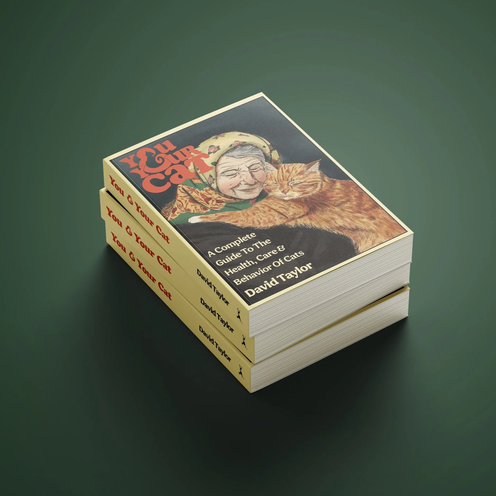
All work was created by Sarah HulstPrograms used: Adobe Illustrator, Adobe InDesign, Adobe Photoshop, ProcreateBook: You & Your Cat
Author: David Taylor
For redesigning this book cover, it was essential to create a full-color illustration showing the relationship between people and their cats. The book is heavily focused on illustrated diagrams and images of cat breeds, so it was necessary to illustrate an image for the front as well as the back cover.
The book's title was also transformed into its own wordmark to condense space and have a motif that can be used in a variety of platforms.
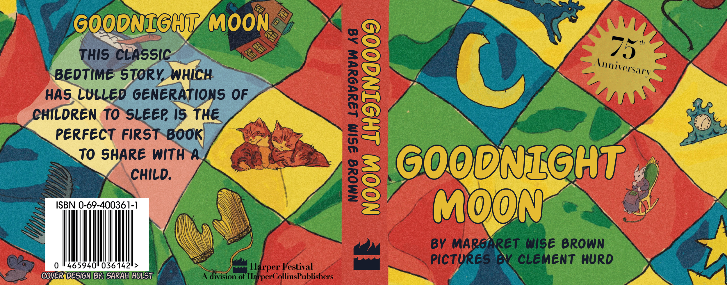
In order to pay homage to the classic illustrations in the iconic Goodnight Moon children’s book I chose to keep the same color palette and font, as well as keep my own illustrations similar to the original.
For this redesign the idea was to create a quilt with all the items mentioned in the book. Quilts are typically used for bedtime to provide warmth when sleeping, but in a variety of cultures quilts have been used as a canvas to create stories on by embroidering and sewing pieces of fabric together.
Word MarkColor PaletteBook: Goodnight Moon
Author: Margaret Wise Brown
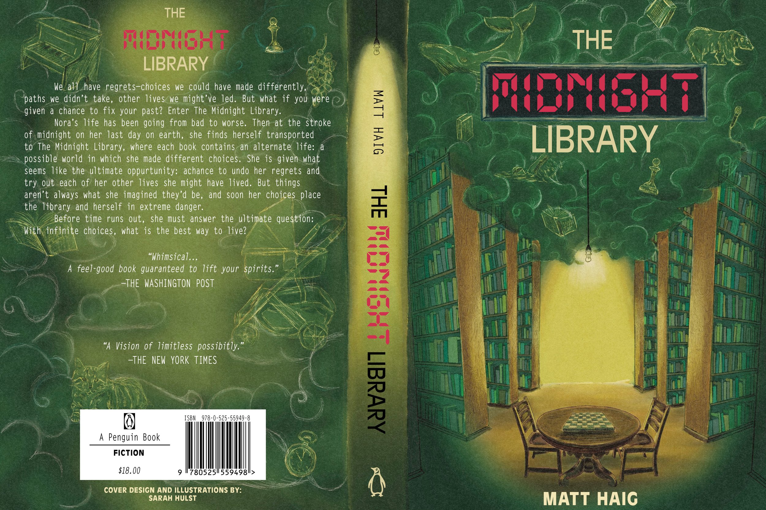
Color PaletteBook: The Midnight Library
Author: Matt Haig
After I finished reading this book, I was inspired to redesign the cover featuring what I pictured the library to look like. I wanted to focus on the bright light from the hanging bulbs and the library's variety of green books. To pay tribute to the content within the book, the misty clouds at the top of the front cover and back cover contain items that are relevant to the story.
Time is a very important part of this story, so I used a font similar to digital clocks to create a design that correlates with the book.
Book: Supporting Multilingual Learners’ Academic Language Development
Author: Luciana C. de Oliveira
This book cover redesign was inspired by the use of abstract patterns, and texture. Features of map like traits are present and inform the viewer how vital connection is regarding this subject. The main goal was to have a design that clearly communicated the title with a mix of serif and sans-serif font.


